
By Thomas Howcroft, Founder and Creative Director, XO3D
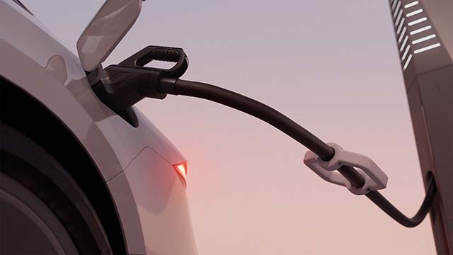
An image of charging infrastructure has several jobs to do. It needs to show the equipment, establish its scale and make the driver’s interaction understandable. When the product is still being developed, those questions arrive before a finished installation is available to photograph.
XO3D’s visualisation work for Petalite addressed that situation. The studio created animation and stills from evolving CAD for the company’s 1MW charging system. The production covered the product’s appearance, its modular arrangement and the experience around the charge post. This is an account of that visualisation project, rather than an announcement of a new charger or a statement about current availability.
Making a technical model readable
An engineering model contains the shape of a product, but it does not decide how an audience encounters it. A useful visual sequence has to establish what the equipment is, how its parts relate and which detail deserves attention next.
For a charging system, a wide view and a close-up answer different questions. The wider composition can establish the relationship between the equipment and a vehicle. A closer view can explain the connection point or interface. Cutting between them should help the viewer understand the same interaction, without losing the sense of where it happens.
Why the cable matters
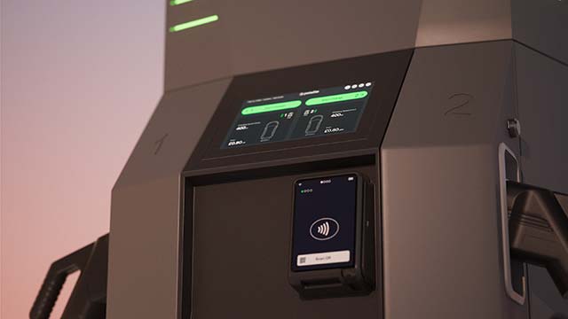
Petalite’s project included dedicated development of the cable animation. Its sag, weight, bending and contact were reviewed in simple greycard passes before final lighting. That work was developed through client collaboration while the design continued to evolve.
The cable is a small part of the overall picture, but it connects the product to a familiar physical action. If it appears rigid, weightless or disconnected from the surfaces around it, the viewer can struggle to read the interaction. Believable movement helps explain the image. It should not be confused with a physical test of the charging equipment.
Reviewing the right things at the right time
A staged visual review makes that distinction easier to manage. First establish the product’s geometry and the action being shown. Then check whether the camera makes that action readable. Surface finishes, reflections and atmosphere can follow once the explanation is working.
For viewers, the result should feel straightforward. They should be able to understand the product’s form and the interaction around it without needing to interpret engineering data. For a project team, reaching that clarity means deciding which details are essential and which can wait for a separate explanation.
CGI is useful here because the visual account can be developed alongside the product. Its responsibility is to represent the agreed design clearly. Performance, compatibility and deployment claims still belong with the manufacturer’s current technical information.
The Petalite project shows how much thought can sit behind a seemingly simple image of a charging cable and a vehicle. A convincing surface is only one part of the task. The relationship between the objects, the sequence of information and the way an action reads are what make the product understandable.
About the author
Thomas Howcroft is Founder and Creative Director of XO3D, a UK studio creating product films, stills and interactive experiences for technology, industrial and premium consumer brands. https://xo3d.co.uk/


